First day cover ·
Kindle's Expanded Spacing Controls Make Reading Easier on the Eyes
Amazon's 5.18.3 update added more spacing controls to Kindles. Here's how to find them and which setting makes the biggest difference.

Amazon's 5.18.3 software update for Kindle e-readers is easy to miss, and it deserves more attention than it got. It expanded the text spacing controls well beyond what owners had before, and those changes can make a real difference to how quickly and comfortably you read on the screen.
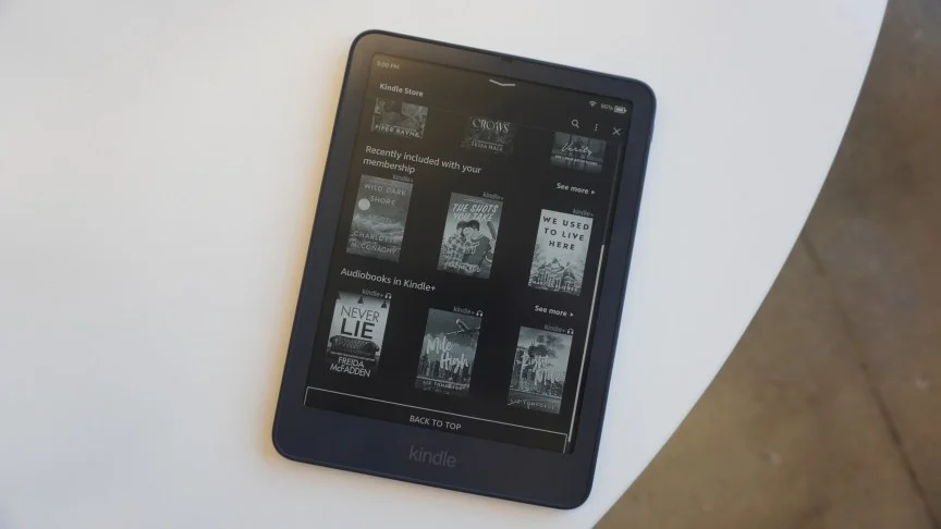
Until this update, Kindle readers had only three options for adjusting spacing. Now there are many more. Amazon's update notes don't emphasize accessibility, but the change is especially useful for readers with poor vision, who often need more room between lines, words or letters to keep text from blurring together. Even if your eyesight is fine, the extra control is worth a few minutes of testing.

Why spacing affects reading speed
Spacing doesn't make text bigger, so it's easy to dismiss. What it does is shape how your eyes move across a page. When lines are tight, the eye can jump to the wrong line or lose its place on the return sweep, which slows you down and adds fatigue. Looser line spacing gives each row a clearer boundary, and that tends to make the next line easier to find. Word and character spacing work differently. They affect how distinct each word shape looks, which matters most on small or dense text.

That's the theory. In practice, the right amount depends on the typeface, your eyesight and how you like to read. Someone who wants to fit more text on each screen will pull in the opposite direction from someone who needs air between lines. The new controls let you pick your own balance instead of accepting a fixed default.

Get the update first
The spacing options require software version 5.18.3 or later, so start there. Swipe down from the top bar to open All Settings, then choose Device Options and select Software updates. The screen shows which version your Kindle is running. In my check, the device reported that it was already on the latest software, which suggests most recent units will have the feature. If yours is behind, install the update before you look for the controls, because older versions won't show the expanded menu.

Find the spacing menu
Open any ebook and tap the top of the screen to bring up the reading toolbar. In the top right, tap the "Aa" icon, then select Font. Scroll to the bottom of the settings page and choose Spacing. From there, you'll see three sliders: Line spacing, Word spacing and Character spacing. Each one has its own bar, so you can adjust them independently and compare as you go.

Test on a page with plenty of text rather than a chapter heading or a short passage. Dense paragraphs show the effect of each change much more clearly.

Line spacing does most of the work
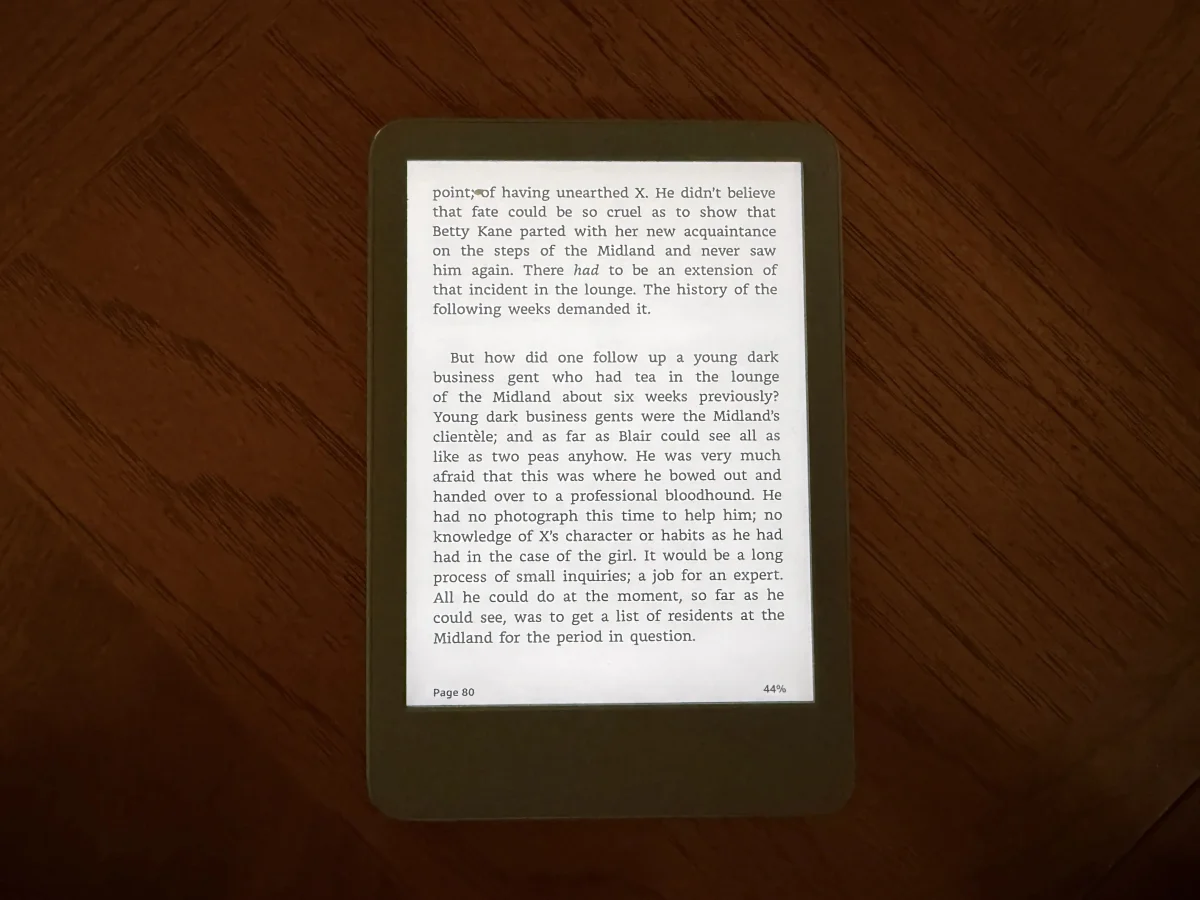
Of the three sliders, line spacing had the biggest effect in my testing, and it's the one I'd start with. I like condensed lines because they let me see more of a page at once, so I kept line spacing at its lowest setting. That's a personal preference, though, and readers who struggle with tracking from line to line will likely find the more open settings far more comfortable. The images below show the default setting next to the most spaced-out option so you can judge the difference on your own screen.

Paragraph, word and character spacing
The walkthrough also covers paragraph spacing, which shows how much separation appears between blocks of text. It's a useful change for long-form reading, since clearer breaks help you pause and find your place after each paragraph. The comparison below shows the default paragraph setting alongside the most spaced-out version.


Word spacing is the next lever. It's most noticeable when you compare the default with the highly spaced setting, because each word starts to stand apart from its neighbors. Character spacing is more dramatic. Letters spread out noticeably at higher settings, which can help with legibility but also changes the texture of the page more than the other two sliders.


The trade-offs
More spacing isn't automatically better. Every increase in line or paragraph spacing means fewer words per screen, so you'll turn pages more often and may feel like you're moving slower through a long book, even if your comprehension improves. Heavy character spacing can make some typefaces look loose or uneven, especially at smaller text sizes. The sensible approach is to move one slider at a time, read a few pages and stop when the text feels effortless rather than when the sliders hit their maximum.
It's also worth remembering that these settings apply to your reading view, not to the book file itself. If you switch devices or apps, you may need to set your preferences again. And if you're reading on a newer model such as the Kindle Paperwhite (2026), the controls should behave the same way once the software is current, though it's always worth checking the menu on your own device.
Who should bother
If you read for long stretches, have trouble tracking lines, or find small type tiring, spend ten minutes on these settings. Start with line spacing, then try paragraph spacing if you're reading novels or long essays. Word and character spacing are best treated as fine-tuning tools. My guess is that many readers will settle on a modest line spacing bump and leave the rest alone, which is exactly the point of offering the choice. The next useful step is to see whether Amazon adds more presets or lets owners save their favorite combinations across books.